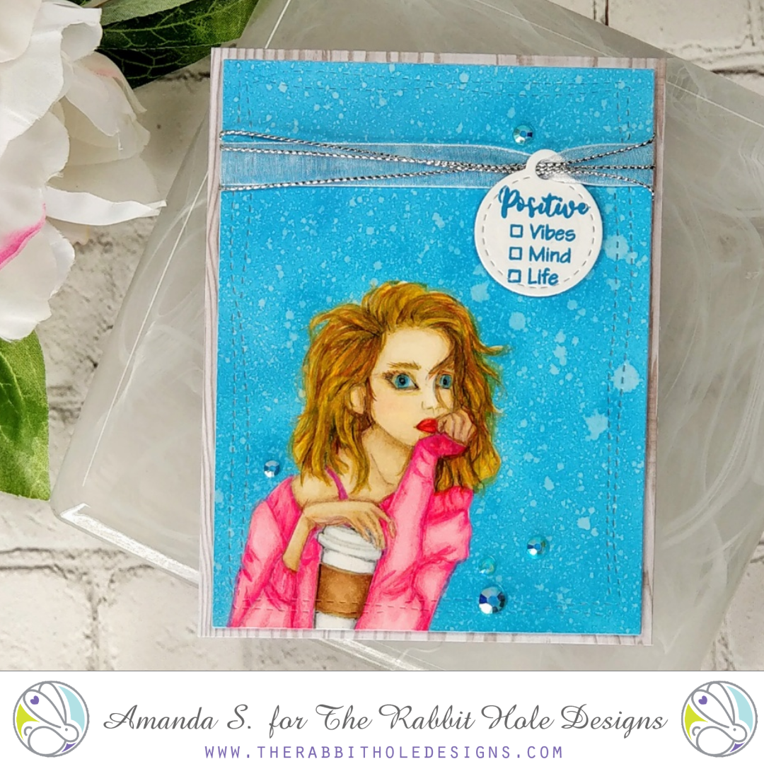
I’ve been coloring along as much as possible for the 30 Coloring Challenge this month, and I decided to get brave and try no-line coloring again. Instead of going with an easier image, I jumped right in over my head, and went for it with the girl in Beautiful Disaster from The Rabbit Hole Designs. I’d colored her before with a black outline, so I felt confident I could pull it off. The result is similar to those cake baking shows where amateur bakers try to recreate a masterpiece. Lol, I nailed it!
First, I colored her with Copic markers. Then, I started with the colored pencils. I’ll be honest, I thought about trashing her. I spent several hours trying to get my colored pencil details right, and there are parts that I actually like, like the coffee cup. But let’s be honest, she looks like she’s watched one too many makeup tutorials on YouTube. Am I right? I mean, you know you’re doing it wrong when your mask looks better than your colored image. I decided to keep her and show you anyhow, just to keep things real. To paraphrase one of my favorite bloggers, Lydia Fiedler, one in ten cards should be a dud to keep you humble.
After my giant hat/swollen head from being on Koren Wiskman’s episode of The Craft Cast with MaryAnn last week, I’m okay with a dud. In case you missed it, it was actually a lot of fun! You have to watch to see what the ridiculous hats are all about…
So what would I do differently, if I were to make this card again? I’d use a darker ink to stamp my image. I used Fadeout ink this time. It’s awesome for a lot of things, but I couldn’t always see where the lines were for this image. I know Kathy Racoosin recommends Warm Glow ink for no-line coloring. It’s darker, so that should help. I would also skip the ribbon at the top; that went out of style a while ago. I don’t know why I added it. I think I was hoping it would distract you from her alien eyes 😉 Honestly, I would probably stamp this image in black again, until I’ve got some more no-line practice. (And practice on florals, or images that won’t look distorted if lines shift a little.)
Alright, now it’s your turn. I’m sharing this on Facebook too, so when you see the post, share a picture of one of your duds. I promise to laugh with you, not at you. That’s what friends are for, right? And we can all use a little laugh these days. That being said, I hope you and your loved ones are safe and healthy. And I hope the TP and noodles get restocked in your area soon…
Thanks for stopping by today. You can find the sister article to this post on The Rabbit Hole Designs’ blog (because if I’m sharing a dud, I have to go big with it). Head on over for more inspiration, and to see much better versions of Beautiful Disaster. It really is a lovely stamp set.
This site uses affiliate links whenever possible (at no additional cost to you), but only for products I actually use and love.


“One in ten cards should be a dud to keep you humble” LMAO
I wish my good ones looked as good as your “dud”…did you hear the eye roll?? 😏
neither of those is a dud. a dud is when there is a HUUUUUUUGE ink smear in the middle of her face. yea, that. sigh.
Agree with comment above from Pauletta. For sure the detailed, sharper lines in card#2 are an improvement. But most of us out here would love to have produced your DUD dearie! As one of our most real people/card teachers, it is simply uplifting to HEAR you believe you created a DUD! 🙂
I like the shared commentary. The bad makeup tutorial part is funny. When I was younger, I was more involved in ceramics and painted everything except for the eyes. I handed that off to my teacher to finish. The rest of the painting was beautiful to me, but the eyes were a struggle point. I never practiced it and never completed any piece on my own.