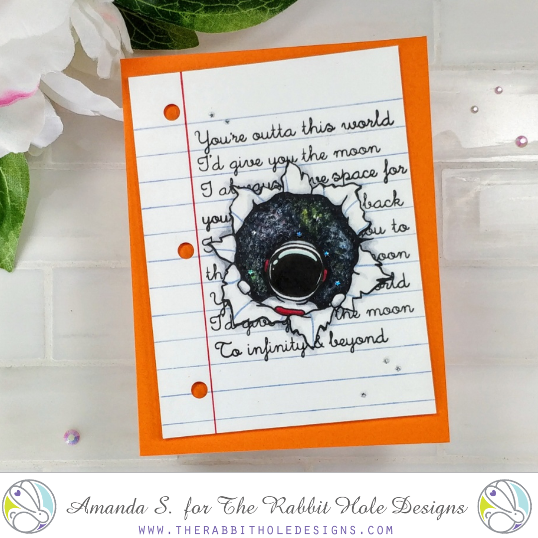
It’s day 3 of the new release from The Rabbit Hole Designs, and today I’m sharing my favorite card so far! I honestly had no idea where I was going with this one when I started, but I really love the way it turned out. And I tried a new (to me) way of creating a galaxy background with Copics!!
Alright, let’s dive in! Since I had no idea what I was going to make, the first thing I did was to stamp the astronaut from Space – Miss You in the center of an A2 panel. I colored him with Copic markers, and because the space behind him wasn’t too big, I decided to create a galaxy background with my Copics as well. Cutting a mask would be easy for this image, but I was coloring outside, and I didn’t want to go pull out the ink blending stuff.
For the galaxy, I scribbled in a few shades of bright colors. Then I outlined the astronaut and the edge of the paper with black and added some dots and thin, shaky lines. Next, I used every shade of cool grey I had, from darkest to lightest, fading in to the colorful scribbles, and adding more stippling. Like all galaxies, it looked horrible, and I was 90% sure I had ruined it, but I kept going. I grabbed my colorless blender and added a ton of dots everywhere; that started to bleach out little stars and rekindled my hope. Once I was satisfied with the blend, I used a white gel pen to dot on tiny stars all over the place. It only took a few minutes; less time than it would have to mask and splatter with white paint. And I was able to control the size and placement of the dots. (Be sure that the gel pen comes after you are done with your Copics. You do not want to try to touch up and get any gel ink on the nibs of your markers; it gums them up.)
So now, my image and galaxy looked really cool, but they were right in the middle of a big white panel. No idea what to do with it from there, so I set it aside for a day. It reminded me of a (much fancier than I actually ever did on my own) doodle on homework, but I was hoping inspiration would strike and I’d come up with a different idea. The more I thought about it, the more I wanted to turn it into a sheet of notebook paper. So I used a ruler to draw a red line down the left side, and pale blue lines across the panel. I spaced them 3/8″ apart so I could stamp the sentiments from the Infinity & Beyond stamp set in between. I cut out a quick mask for the image, and stamped the sentiments in black, shifting and masking words to fit the panel. I love the scripty handwritten font.
With the stamping done, I punched three holes on the side and popped the panel up onto a bright orange card base with foam tape. A few tiny silver stars glued to the galaxy, and scattered on the card front, pulled it all together. And just like that, it became my favorite card for the release! I almost never start a card like this without a plan. How about you? I think I’m going to try winging it more often, and see what I can come up with. It might be more challenging with interactive cards, but not for scenes like this. What the heck, it’s only paper, right?


You’re going to “try more winging it?” HAHAHA Amazing Amanda we ALL hope one day to be able to “wing it like Amanda” you silly girl! I gotta say the level of ink work on this one is …well…Amazing!
Spectacular. Love to start out with an
idea and after a lot of tweaking – it becomes
a wonderful piece. Who would think of
notepaper as the base. thanks for sharing
txmlhl(at)yahoo(dot)com
Wonderful example for the set use. I like the galaxy creation as well as the custom note page.
This came out AMAZING! I was convinced the notebook paper was a stamp of its own. Well done!
This set is cute. Who would think of a hole, tee hee. Any image could swirl down it Loving the interpretations of each designer. Have a couple favorites for sure! Fun!