Hey crafty friend, I’m back with a quick and easy way to warm up Autumn color blends for your cards this fall. The secret is Warm Grey markers! I know, it’s not a big secret, but it’s a good secret 😉 Just watch the way the images on my cards start to pop, as they’re surrounded by a warm grey glow…
STEP ONE:
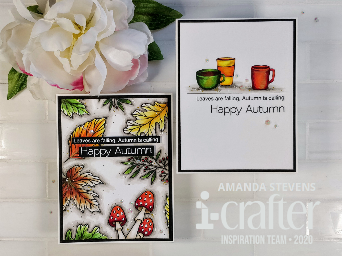
Stamp your images, and color them with Copic markers. I used the Latte Coffee Sentiments and Leaves Are Falling stamp sets from i-crafter for today’s cards. (I’m in love with both of these sets!) The black line I drew under the mugs will help ground them, and give me a place to stop coloring my greys. Notice how I left some white areas on the tips of the leaves? Those highlights will really pop, once the images are outlined.

STEP TWO:
Add shading, or outline your images completely, with Warm Grey Copic markers. I started with W5, closest to my images, then moved to W3 to expand and blend. Next, I came back around with W1 to soften the edges even more. To feather the W1 into the white space, I used my 0 Colorless Blender. Try to use short strokes when outlining your images; they will blend into the next color a little easier that way. (That’s a tip I picked up from Jammie, at Sweet Sentiment!)

STEP THREE:
Okay, this one is optional, but I think it really helps add texture, and can hide uneven blends. Step three is to add dots. I used my W5 marker, along with gold, and white gel pens, to add lots of different sized dots to both panels. For a little more shine, I drew some gold lines on the mugs, and leaves, then quickly smeared them with my finger. This gives you a little shimmer, without heavy, opaque gold lines. (It’s a nice touch for coloring hair too.)

STEP FOUR:
Turn your panels into cards! I trimmed both of these down, popped them up with fun foam onto black mats, and then onto white card bases. The sentiments were stamped directly onto the panel with the mugs, but embossed on strips and popped up on the falling leaves panel. A few scattered gems add more sparkle.


I love how both of these turned out. Do you have a favorite? What do you think of the warm grey shading? I know you might be tempted to use your cool greys here, because we’re always told to save the warm greys for living things. (That’s because they add warmth 😉 ) But I hope you’ll give this a try. Just to help put things in perspective, I’ve got another card to show you. It’s outlined with a pale yellow, which also adds warmth, but for fall, we want to create a cozy feel, not a hot summer day feel. Do you see the difference?

I’d love to know what you think. And I’d love to see your take on this trick. If you give it a try, tag me on social media so I can cheer you on!
Thanks so much for stopping by today. I’ll be back tomorrow with another pair of fun cards to share. Head on over to i-crafter if you’d like to see more inspiration with the Latte Coffee Sentiments and Leaves Are Falling stamp sets.
This site uses affiliate links whenever possible (at no additional cost to you), but only for products I actually use and love.

Absolutely fantastic Amanda!!!
I ALWAYS reach for my cool greys for shadows, this is such an awesome tip and I can’t wait to try it out!!
Love the dots too and the smeared gold is genius!!
Thank you for the goldmine of tips this post is!! 😍😃
Nice cards and a nice trick. I will have that in the back o my brain. . .
I love your card and the tutorial was excellent. I am definitely going to try this technique for shading on a project this week. Good luck on MFT Challenge #150 too!!!